No products in the cart.
Acrylic Block Prints, Acrylic Prints
Acrylic Photo
DesignCONSIDERING SCALE AND PROPORTION IN DETAIL WILL SOLVE DESIGN & SPACE EASILY.
Artworks versus the wall space and surroundings are as important and selection art.
Think about the size of the wall space and the size and aspect ratio of the acrylic photo, for example, that would work best in that space.
Consider scale, for this reason, the proportion of the artwork versus the wall space and surroundings may not fit the space.
In particular behind a couch, for instance, a landscape will ultimately fit better
consider the size and shape of the furniture, on balance, create a group of prints that are in proportion.
A collection of tiny prints hung on a vast wall above a huge sofa, to demonstrate, may look a little lost and disconnected from its surroundings.
LAYOUT DESIGN OF MULTI ACRYLIC PHOTO COLLAGE
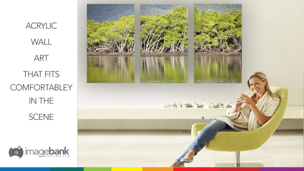
Dividing one single image for a multi acrylic photo design is certainly striking, together with, several factors to consider.
The artwork itself, space and perhaps most importantly personal taste, after all, there is no wrong answer.
A particular image may suit some design styles over others. It may be the case that the best option for the image is not to divide it at all.
Experiment by dividing your image into different designs, on the whole, the outcome will create something that appears well throughout.
If you require help or advice on how to split an image for the design of your acrylic photo. Please get in touch, we are here to help.
LOOKING AT ACRYLIC PHOTO, IN ANY EVENT, THEY ARE TO BE LIVED WITH.
Consider the best way to get it right! considering you will be living with your choices.
It’s important to hang or mount artworks at the correct height, this is not to say, there is no one set rule.
Hanging prints and picture frames too high, by and large, is a common mistake. The general rule of thumb, in general, the horizontal line running through the centre of a piece of artwork or a group of prints should be positioned at eye level.
After all, acrylic photos are there to be looked at… make it easy to do so.
Again, consider the space, how does the artwork relate to its surroundings?
For example, if you are hanging prints above a sofa with a very low back, if hung at eye level the artwork may look a little disconnected with the couch if the space between the back of the sofa and the bottom of the artwork is too large, in this case, the artwork may look better positioned slightly lower down.
When looking at the size and positioning a good tip is to cut paper templates to the size of the total size of the artwork and try them on the wall in different positions before making any holes in the wall.
If you would like to talk to one of our print professionals about Acrylic Photo or anything else please Contact Us.
An example of Acrylic Photo at Perrin Clarke Photography


